Top 10 Film Posters of 2016
(Originally posted 28th December 2016)
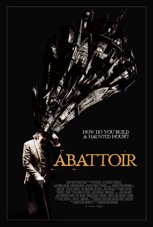
10. Abattoir
Abattoir is a low-budget horror movie and that's pretty much the extent of my knowledge on the subject, but having seen this wonderful design, I'm going to have to look into it in a bit more detail. That's what posters are supposed to do, right?
9. Suicide Squad
I still haven't seen the finished product (the quality of which was hotly contested by Allen and Calvin in our most recent episode), but there's no denying that the film's posters were bold, daring and engaging, more than anything to their use of an unusually bright and cheerful colour palette for such a "dark and brooding" franchise.
Related episodes:
"Batman v Superman: Dawn of Justice"
"Review of the Year 2016"
"Suicide Squad"
8. Rogue One
This strikes a lovely balance between homage to classic, iconic visual cues from the original film, the classic Star Wars poster "look" and, at the risk of sounding like a ponce, simplistic geometric abstraction.
Related episodes:
"Star Wars: Episode VI - Return of the Jedi"
7. The Void
Another wonderful, enigmatic bit of horror design for a low-budget piece of work that spent most of the year under my radar. Does everything a good poster should do.
6. Don't Breathe
This looks like a classic piece of the best kind of trashy, Italian horror movie from the '70s or '80s and it conveys all of the key elements of the plot at the same time.
Related episodes:
"Review of the Year 2016"
5. Doctor Strange
Here is a poster that fully embraces the new-age, hippie ideals present in the film it's selling. It feels like a mural on the side of a van you'd see following The Grateful Dead on tour and I love it for that.
Related episodes:
"Iron Man"
"Review of the Year 2016"
4. Keanu
The posters for Keanu were essentially a series of recent and/or Keanu Reeves movie posters with Keanu, the titular cat's, face photoshopped on top. This take on the poster for The Big Short takes the joke to its logical conclusion, stckiing the cat into a poster of a film for a genre that has nothing to do with anything four times. What can I say? It's certainly my sense of humour.
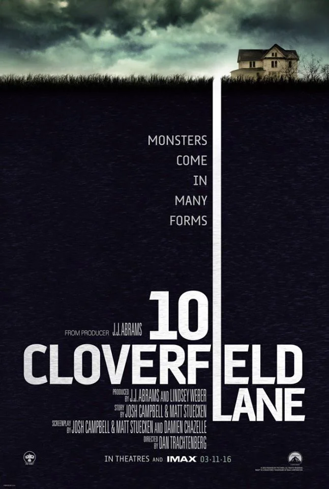
3. 10 Cloverfield Lane
Given how 10 Cloverfield Lane's marketing was built around its sense of mystery and didn't want to give much away, not to mention that 90% of the film is essentially just three people sat in a bunker, it's remarkable how enigmatic the film's posters managed to be whilst also remaining completely true to the film's tone.
2. Deadpool
Deadpool's marketing was more on point than the film itself, which is saying something. This sarcastic poster, painted the film as a traditional rom-com without lying, per se.
1. Blair Witch
This is the poster for Blair Witch back when it was still pretending to be an original horror film called The Woods. The use of trees as bars trapping someone within is wonderful.


